CASE STUDY – 2021
WEB APP VIDEO PLAYER REDESIGN
The player and its settings are crucial to streaming. Users need to fast forward, rewind, and update their settings without disrupting the video in the background. This project aimed to increase user engagement by improving the UI and settings for the video player.
My Role
Lead designer – user research, design, prototyping
Team
Eliza Cichonski – Director of UX
Victor Fong – Senior UX Designer
Mark Baker – Senior UX Designer
Project Overview
The Project
Curiosity Stream is a documentary streaming service with over 3,000 titles and 19 million subscribers worldwide. Between November 2020 and March 2021, the UX team redesigned the web app. This case study highlights the research and design work I did for the video player.
The goal of this project was to update the player to increase engagement and create a more consistent user experience across devices. One of Curiosity Stream's KPIs was to get people to watch more, so our team made an intuitive, functional, accessible player that improved the user experience while supporting these business objectives.
The Problem
Based on user research, our team knew there were usability problems and pain points we needed to address with the video player. We used the redesign as an opportunity to address three primary concerns while improving the overall UI of the player.
01 – Autoplay
Autoplay settings were located on the Account page, which wasn’t intuitive for users.
02 – Settings
Settings for subtitles, streaming quality, and playback speed didn’t save from one video to the next and the visual hierarchy of the settings made them difficult to use.
03 – Up Next
Shows played out of order in series, which was confusing for users. In addition, the You May Also Like carousel below the player didn’t have descriptions and didn’t indicate what would play next.
The Results
The redesign led to:
• 16% decrease in cancellations
• 16.9% decrease in browse-to-watch ratio
• 3% increase in video completion rates
The Solution
Autoplay
During the research phase of this project, many users brought up about autoplay. At the beginning of this project, autoplay was toggled on or off via the Account page. This setting wasn't obvious, and many users complained that they did not realize autoplay was on, which caused data overages, especially for users who watched on mobile.
To address this, I removed the autoplay settings from the account page and added an autoplay toggle to the streaming bar, with tooltips on hover on desktop to indicate whether autoplay was on or off. There are no tooltips on mobile due to space constraints.

Settings
Many of Curiosity Stream's users live outside the United States, so subtitle settings are crucial. Our team also wanted to improve the accessibility of our apps, so I incorporated upgraded accessibility settings to improve subtitle usability.
Users can now update the settings using the nested Subtitle Settings link within the subtitle modal. In addition, settings now save between videos, so users don't have to manually adjust their settings every time they start a new program.


Up Next
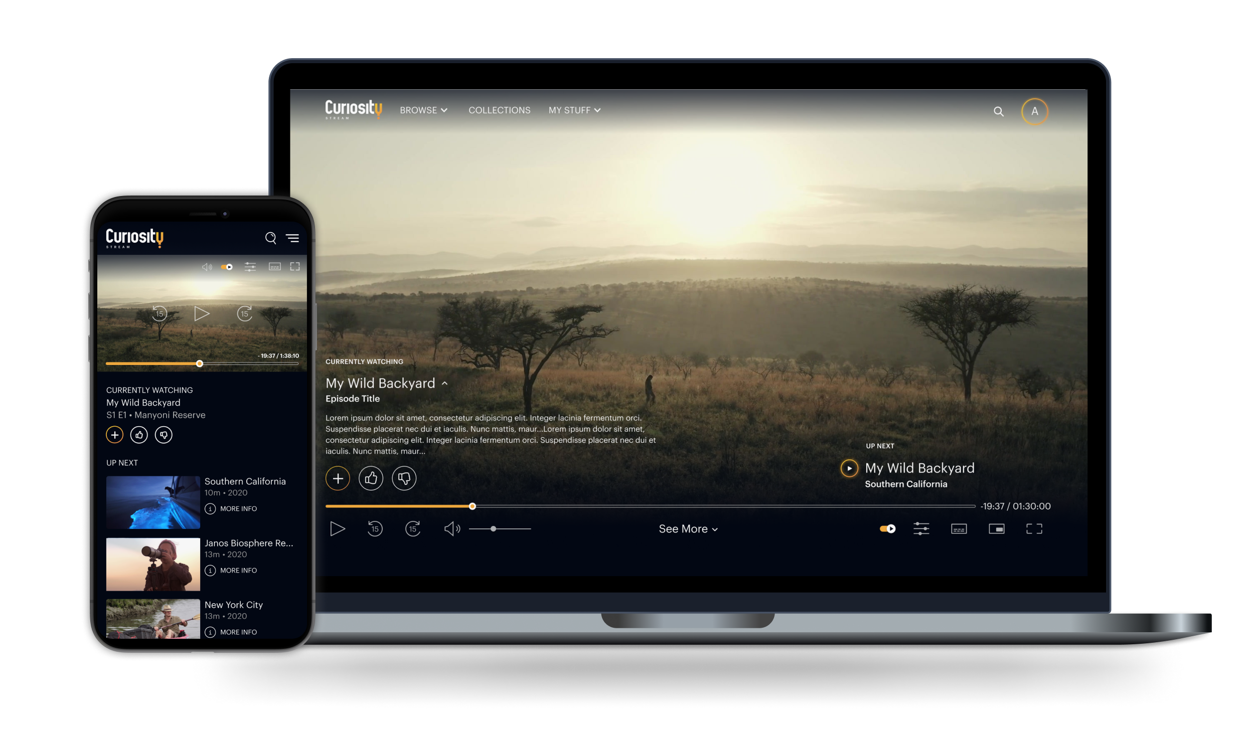
Curiosity Stream had issues with videos playing out of order, which was confusing for users watching a series. To give users more context as to what they were watching, I added a Currently Watching section on the lefthand side of the player and an Up Next section on the righthand side of the player, both of which appear on hover.
On desktop, the Currently Watching feature has a caret, which expands to show the program description. Due to screen size limitations, this section appears below the player on mobile. Users can also like or dislike the program they're watching or add or remove it from their watchlist. The Up Next carousel below the player now includes video descriptions.

UI Improvements
Our team made additional improvements to the player’s UI. We modernized the icons and made them thinner to match the new branding, and we also added fast forward and rewind 15 seconds buttons. We incorporated a video scrubber, which appears on hover. We also improved the end card, by reducing the countdown from 30 to 15 seconds, and added a thumbnail image with play and more info icons.

The Process
Research – Phase I
Between July and August 2020, I monitored user feedback from an in-app HotJar feedback questionnaire, where we asked users what could be improved about Curiosity Stream. Each week, I created a report and highlighted user feedback to identify trends and areas for improvement.

I also did an extensive competitive analysis and examined the video player and its core functionalities across different streaming services. It was important that the player fit users' mental models to ensure ease of use.
Research – Phase II
In September 2020, Curiosity Stream contracted Roger, a creative agency, to rebrand the web app to match the work they had done for Curiosity Stream’s linear channel in South Africa. Based on our research, Eliza, Victor, and I created sketches and low-fidelity mockups of the entire web app with the proposed changes, which we submitted to Roger. Roger then created high-fidelity mockups in Photoshop to reflect the new branding. Below is an early sketch of the player and its settings.

Once our team received the mockups from Roger, I conducted a survey on SurveyMonkey and asked users to rate whether they preferred images of the redesign or the original version of the app. Users overwhelmingly preferred the redesign. I then synthesized users' feedback for the UX team before we started to work on high-fidelity mockups in Figma.

Exploration & Iteration
Once the research was complete, the UX team's first task was to establish a design system with updated colors, fonts, and icons based on the branding work done by Roger. Using Figma, our team created components for both the web and mobile player to enhance consistency across the app.

Below is an early mockup of the player and its settings. I explored different layouts and color schemes for the player, and I experimented with putting settings in the center of the progress bar. After multiple iterations, I decided to group the primary player functions – play, pause, fast forward, rewind, and volume – at the lefthand side. I then grouped the settings on the righthand side. By grouping similar settings together, I was able to improve the informational architecture and create a more cohesive UI.

Prototyping
Once I finished the high-fidelity mockups, I prototyped the player in Figma. I included all states and interactions, such as hover and modals. When the prototype was finished, I presented it to the frontend and backend developers to see if they had any feedback before beginning development.
Final Product
The result of this project was a much cleaner, more modern, and more useful video player. By incorporating user feedback early on in the redesign process, our team was able to improve the settings and hierarchy of the player while still matching the overall style of the rebrand.

The Outcome
Analysis
This was a fun and challenging project that incorporated many aspects of UX, including research, design, and prototyping. This project was a truly collaborative process and allowed me to work closely with members of both the UX and development teams.
I learned an incredible amount throughout the redesign. One of my main takeaways is how to approach a complicated UX project while building a design system from scratch, which includes analyzing user flows and edge cases before diving too deep into the design.
Next Steps
The player page will continue to be monitored and adjusted as we receive user feedback and do additional research. The redesigned player for the web app will serve as the basis for Curiosity Stream’s new mobile and TV apps, which will launch in 2022.