CASE STUDY – 2021
MULTIVARIATE HOMEPAGE OPTIMIZATION TEST
Curiosity Stream’s homepage is the primary hub for content discovery. With different carousels and categories, the homepage allows users to find relevant programs and build watchlists. The goal of this project was to optimize the homepage layout to increase user engagement.
My Role
Lead designer – design, research, testing
Team
Eliza Cichonski – Director of UX
Matt Jennings – Frontend Developer
Andre Silva – CTO
Client
Curiosity Stream
Project Overview
The Project
In November 2020, the UX team started a total site redesign. The goal of the redesign was to create greater consistency across apps and devices and also visually align the company with the rebranding work Roger did for Curiosity Stream’s linear channel in South Africa. When the redesign launched on the web app in March 2021, Curiosity Stream contracted Evolv, an AI testing company, to help us quickly iterate and validate the new designs. Evolv's testing platform let us test thousands of combinations to help us determine which combination of variants led to the greatest increase in user engagement.
For this project, we defined user engagement as increasing both the number of video starts and the length of time spent watching. While we wanted users to find something to watch quickly, it was also crucial that users found programs they enjoyed. Our secondary metrics for this project were decreasing cancellations and improving the browse-to-watch ratio.
The Problem
In the first phase of the redesign, we adjusted the homepage layout by adding 2:3 carousels and featured sections with callouts to better engage our users. Since the redesign was a drastic departure from the previous version of the site, it was important for us to validate the design changes while also improving engagement.
When the designs launched in March 2021, I monitored the homepage using HotJar recordings and heatmaps. The data team also closely tracked the redesign to ensure that the design changes we made didn’t negatively impact engagement and retention. Based on the research and data, we identified four key areas to test.
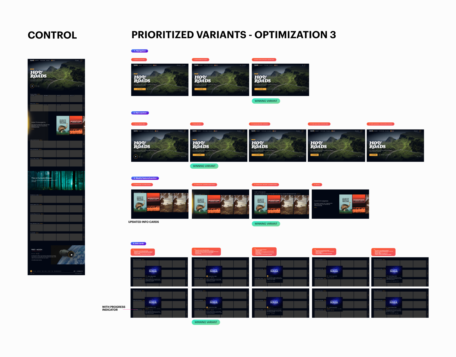
01 – Navigation
In the first release of the redesign, we minimized the navigation, using only an icon for search and a letter to indicate the users’ account. We wanted to see if adding words alongside the icons helped engagement by increasing the speed at which users could find shows and access their account information.
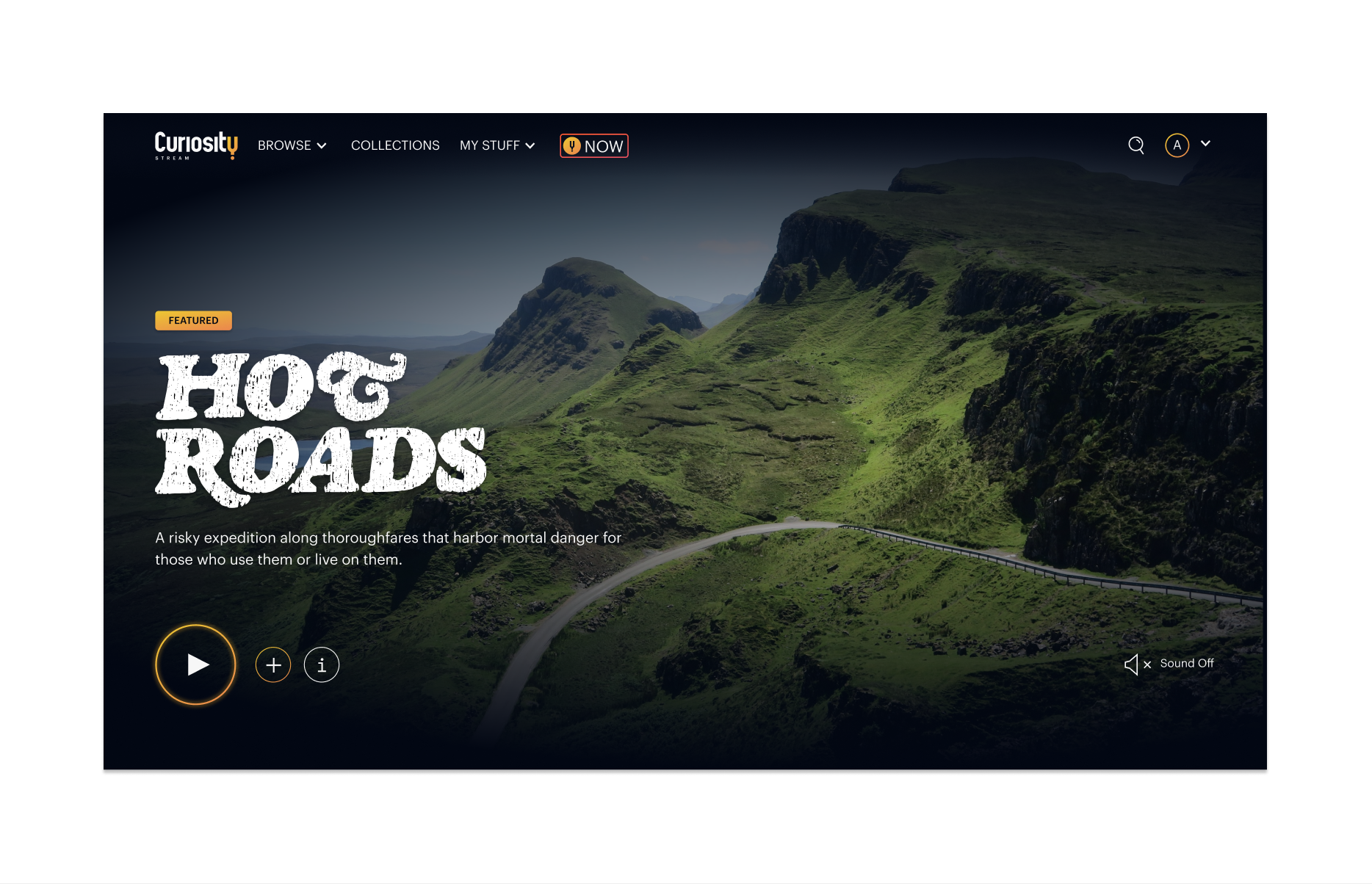
02 – The Hero Section
In the redesign, we changed the play button from a square CTA to a rounded play icon to align with Roger’s branding. Since the hero section is critical for engagement, we wanted to test whether a more prominent CTA and secondary CTAs (including Add to Watchlist and More Info) led to more video starts.
03 – Featured Section
The weekly featured section is curated thematically. In the initial release of the redesign, we added an aurora and moved the descriptions to the lefthand side of the thumbnails, so only three titles were visible at once. We wanted to test this section to see whether showing more videos in the carousel led to increased video starts.
04 – Info Cards
The info card appears on hover and gives users a synopsis of the show, its run time, and the number of episodes if it’s a series. We wanted to test whether more or less information improved user engagement.
The Results
After three months of testing, the multivariate homepage optimization test led to a 2.3% increase in user engagement.
The Solution
Navigation
The navigation is crucial for users to browse, search, and access account information. Our hypothesis in the initial phase of the redesign was that removing additional clutter in the navigation would let users focus on the content. Based on testing, we discovered that an even more simplified version of the navigation had the biggest impact on engagement.
Hero Section
Roger’s branding work included an incredibly minimal hero section. Based on data after launch, we noticed a dip in video starts for the hero video, and it seemed likely that the thin buttons led to a decrease in the video starts. To test this hypothesis, I created multiple versions of the hero, with stronger primary CTAs and secondary CTAs. The winning variant placed more emphasis on the play button and kept the minimal icons for secondary buttons.

Featured Section
The featured carousel is curated thematically each week. Before the redesign, the thumbnails were in a 16x9 aspect ratio, which didn’t draw much attention to the content. We adjusted this section to 2x3 thumbnails and added an aurora and description on the left-hand side. We wanted to test if seeing fewer thumbnails impacted engagement, so I created multiple variations with updated layouts. The winning variant supported our hypothesis, and had 5 visible thumbnails instead of 3.

Info Cards
Info cards are crucial for browsing on the web app. In the initial phase of the redesign, we designed the info cards with a large play button which partially obscured the thumbnail. The goal was to get people to click on more info and be taken to the program details page. To test this section, I experimented with various layouts including more and less information on hover. I also removed the large play button and moved it below the thumbnail. The updated designs performed better than control and led to an increase in video starts.

The Process
Research
After the redesign launched, I monitored the homepage using HotJar heatmaps and recordings. This information was crucial in informing the optimization test, as we could see how users were behaving. Using recordings, I noticed that users weren’t clicking the more info button on the info cards, which led us to prioritize the info cards as one of the variants for testing.
I also created a user journey map for the site, with an overview of how users felt when deciding what to watch. This helped me empathize with our user base at each phase of their watching journey.

Exploration & Iteration
Once I completed the initial research phase, I started to create iterative designs for each of the four sections we decided to test. To keep things low-fidelity, I began sketching my ideas to see what might work.
Based on the sketches, I chose several iterations for each section and translated the designs into high-fidelity wireframes in Figma. After the designs were finished, I worked with the developer to QA all of the variants to ensure that the UI was correct and everything was working properly.
Final Product
The results of this test can be seen below with the updated designs for each section. While some of the changes were small, it was important to thoroughly test each component to validate the redesign. Evolv’s software is a powerful testing tool that provided us with a broader view of engagement rather than testing each section in isolation.

The Outcome
Analysis
This project allowed me to dive deeper into testing and learn what to prioritize based on both business and users’ needs. Being able to test thousands of combinations of variants was incredibly powerful, and gave us great insights into our users’ behavior and what drives engagement.
Next Steps
This project helped lay the foundation for a personalization project the UX team is currently working on. Now that we have tested the homepage layout, the next steps for the UX team are to personalize the genres and carousels on the homepage based on user’s interests and viewing habits. We are working on developing user profiles. Both the personalization and user profiles projects will launch in 2022.