CASE STUDY – 2021
ACCOUNT PAGE REDESIGN

The account page is a key information hub with multiple user journeys, such as password changes, billing updates, and cancellations. The goal of this project was to increase retention and align the account page with Curiosity Stream's rebrand.
My Role
Lead designer – user research, design, prototyping
Team
Eliza Cichonski – Director of UX
Victor Fong – Senior UX Designer
Mark Baker – Senior UX Designer
Project Overview
The Project
Between November 2020, and March 2021, the UX team redesigned Curiosity Stream's mobile and web apps. The goal of the redesign was to increase engagement and improve retention.
I was the lead designer for the account page. The goal of the redesign was to create a more navigable page, which better highlighted critical user journeys, such as updating emails, passwords, and payment details.
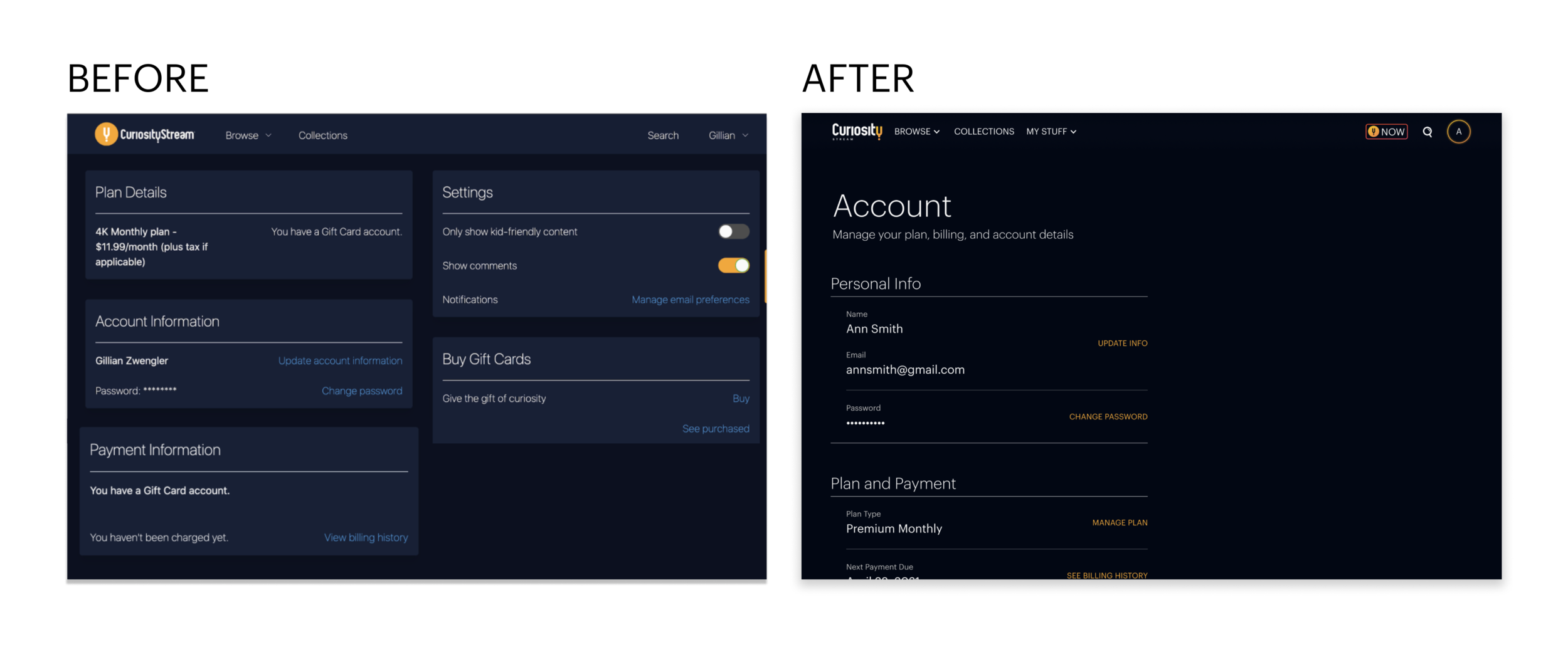
The Problem
Curiosity Stream's account page was difficult to navigate, and the design didn't translate well to mobile. Because the designs used cards, it was difficult for the UX team to add new settings to the account page because it visually threw the page off balance. I identified three main areas for improvement.
01 – Layout and Hierarchy
The initial design used cards, making it difficult for our team to add new settings without visually throwing the page off balance.
02 – Modals and Overlays
The CTAs opened modals on the account page, which created visual clutter, and posed a challenge for accessibility.
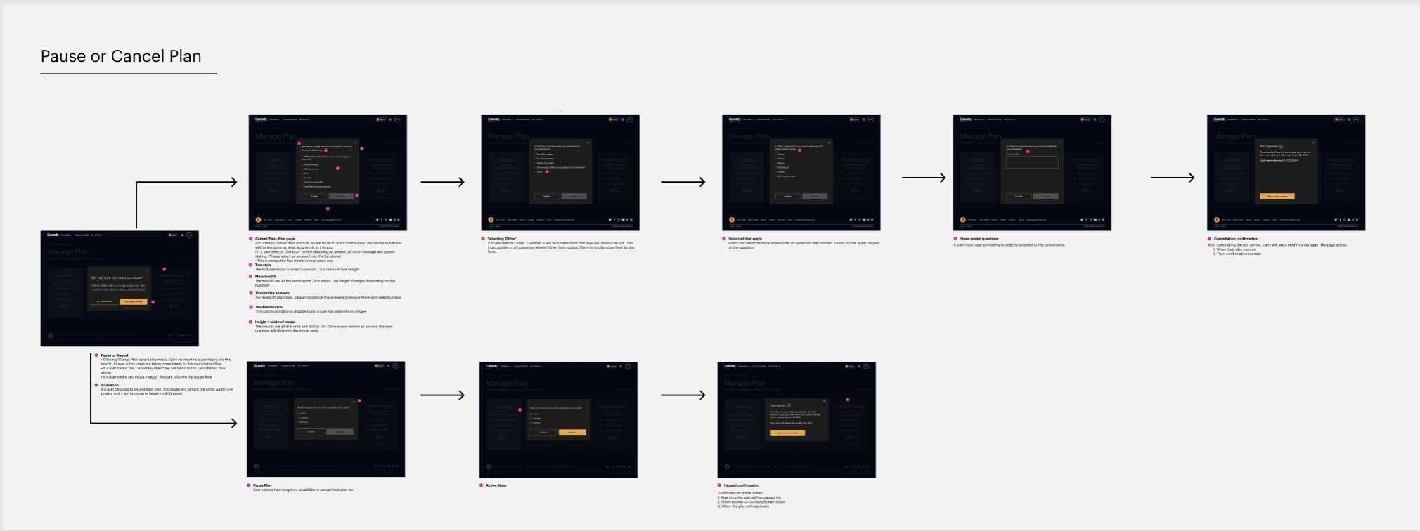
03 – Cancellation Flow
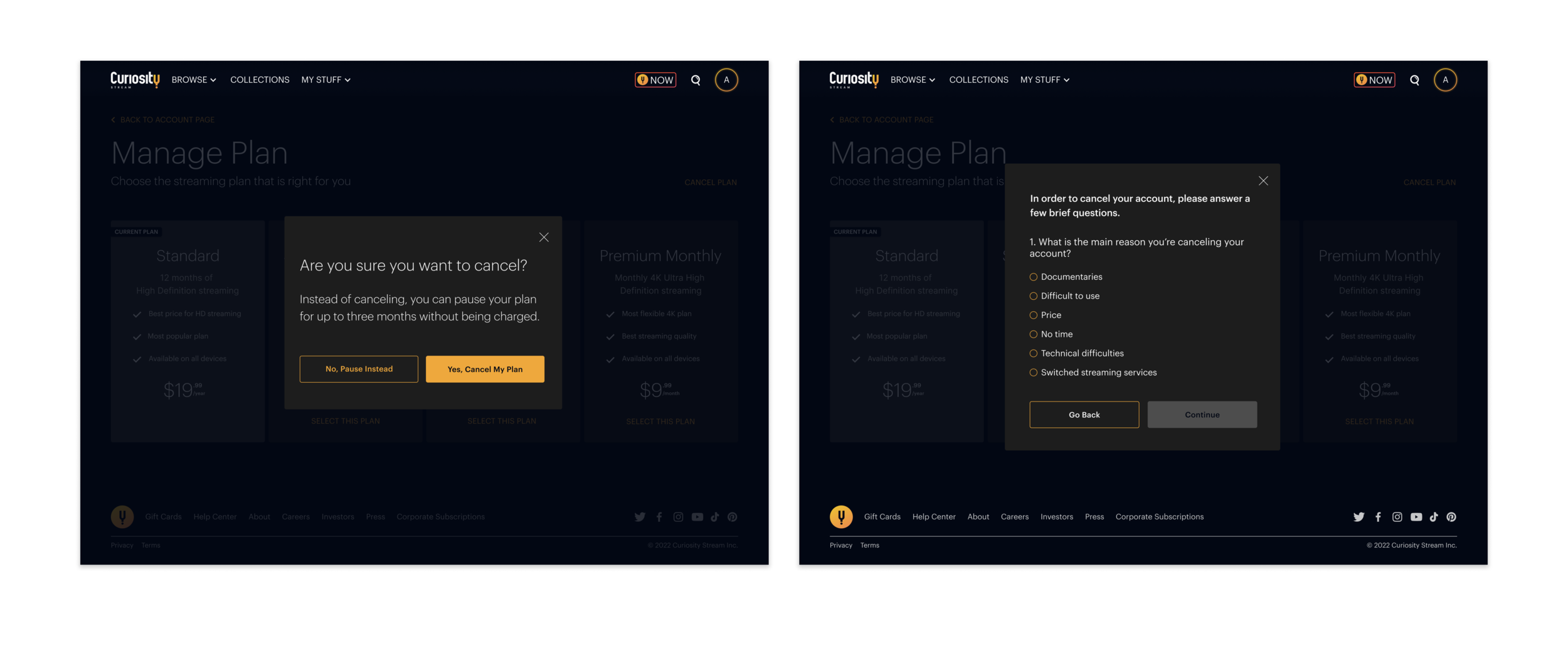
Cancel Plan was a prominent CTA on the account page. We needed to add a bit of friction by introducing an extra click. We also had to improve the exit survey and make it easy for monthly users to pause their plans instead of cancel.
The Results
The redesign led to:
• 16% decrease in cancellations
• 16.9% decrease in browse-to-watch ratio
• 3% increase in video completion rates
The Solution
Improved Layout and Hierarchy
Removing the cards gave us greater design flexibility and an improved user experience for both web and mobile. The page layout is in order of relevance, with the two most used settings at the top – personal details and plan information. I also combined two cards from the previous design, plan details and payment, and created one new section.
I updated the background color to black to incorporate the updated branding, and the CTA buttons changed from blue to yellow to match the new logo. The UX team also created a new design system for our fonts, which allows us to emphasize essential information, such as headings.

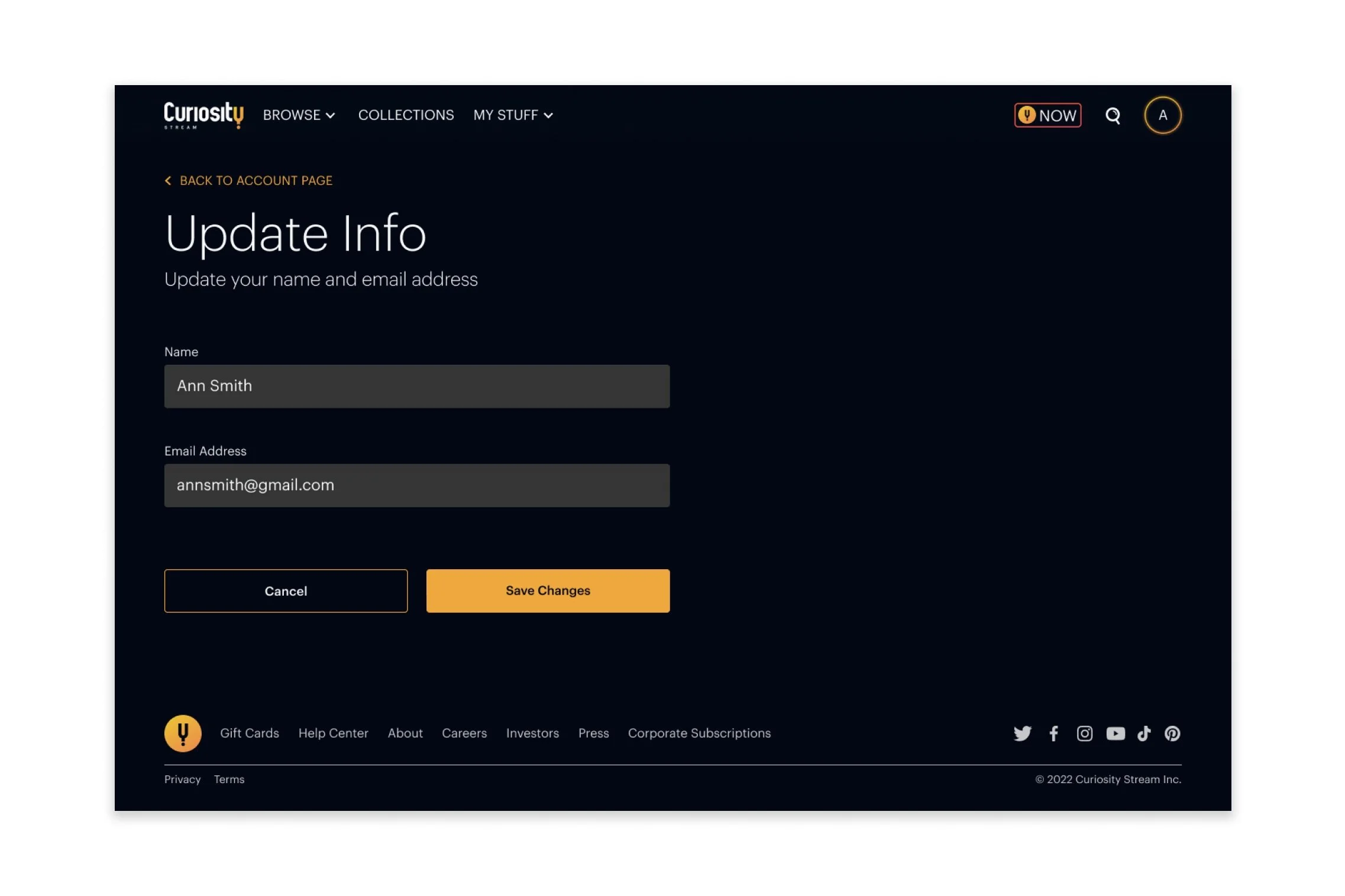
Removing Modals
In the previous version, clicking any CTAs opened a modal on top of the cards on the page, which was visually cluttered and didn't translate well to mobile. The CTAs now open a new page, which keeps the user more focused on the task at hand. We also added a secondary 'Back to Account Page' at the top of each page to ensure users could quickly return to the account page if needed.
Cancel Plan
I eliminated the prominent Cancel Plan CTA and used a Manage Plan CTA instead, adding one extra click to cancel a subscription. Users could then select the Cancel Plan option on the Manage Plan page. I also updated the cancellation survey to align with the new design system. The cancellation survey is essential as it provides critical feedback that helps us continually improve the service. In addition, we emphasized the pause plan option for monthly users.
The Process
Research
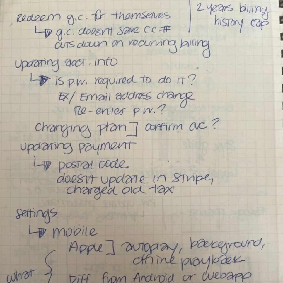
Before starting the project, I met with the head of customer service to discuss her team's account-related pain points. After speaking with her, I created multiple user flows and journeys to help improve common problems facing the customer service team. One of the primary concerns was the payment flow and plan cancellations. Below are some notes from the first meeting I had with the head of customer service.
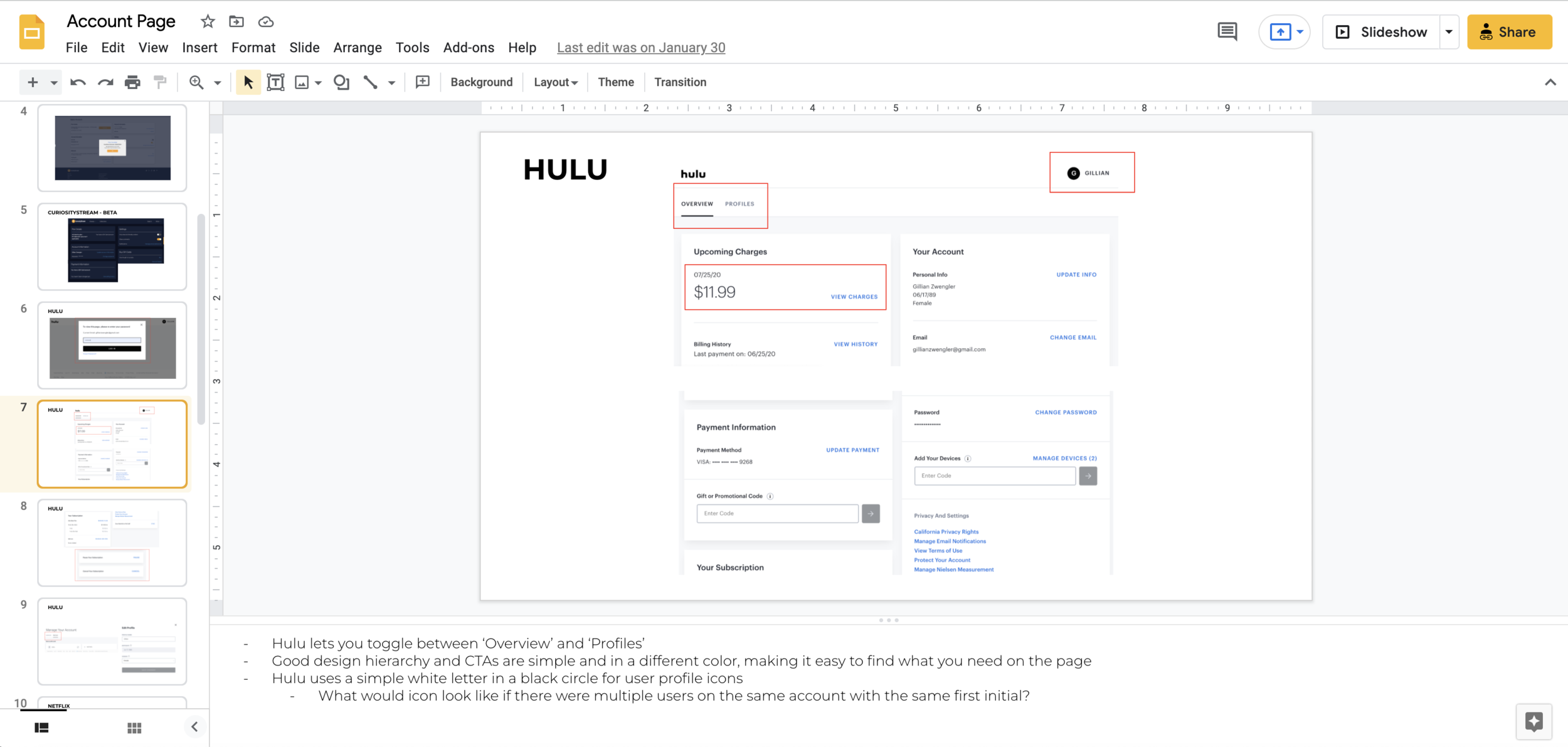
Once I understood the primary user flows and journeys, I did a competitive analysis of account pages across different streaming services. I examined the layout of the account pages, which helped inform the hierarchy of the settings and gave us a better baseline for the design moving forward.
Exploration & Iteration
I sketched different layout options for the account page to keep things as low-fidelity as possible. I wanted to get a better sense of visual hierarchy before diving too deep into the design.
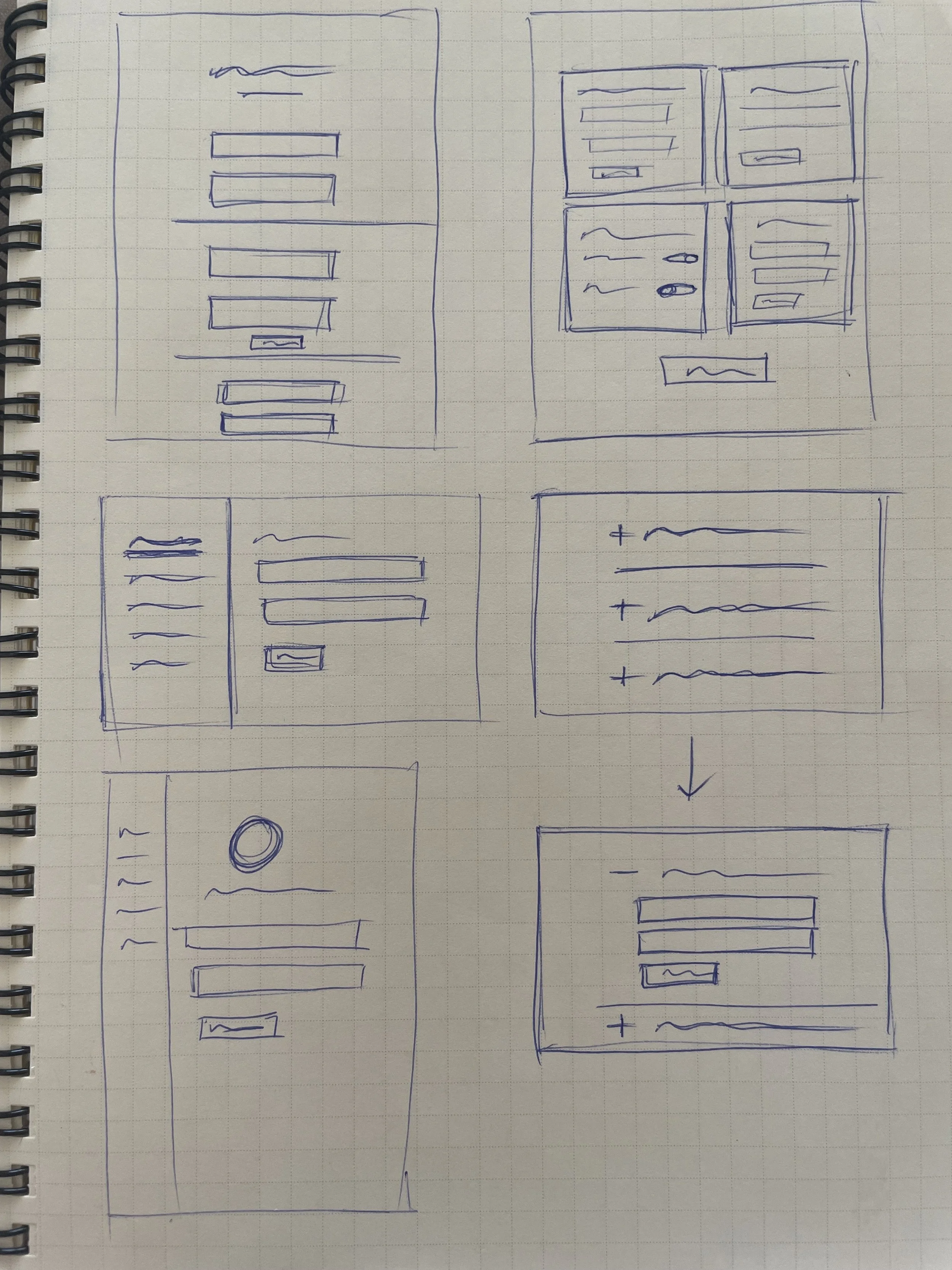
Once I finished the sketches, I explored the layouts in greater detail with wireframes in Figma. I then met with the UX team to discuss the designs, and we chose the vertically designed mockup, which gave us the most flexibility when adding new settings.
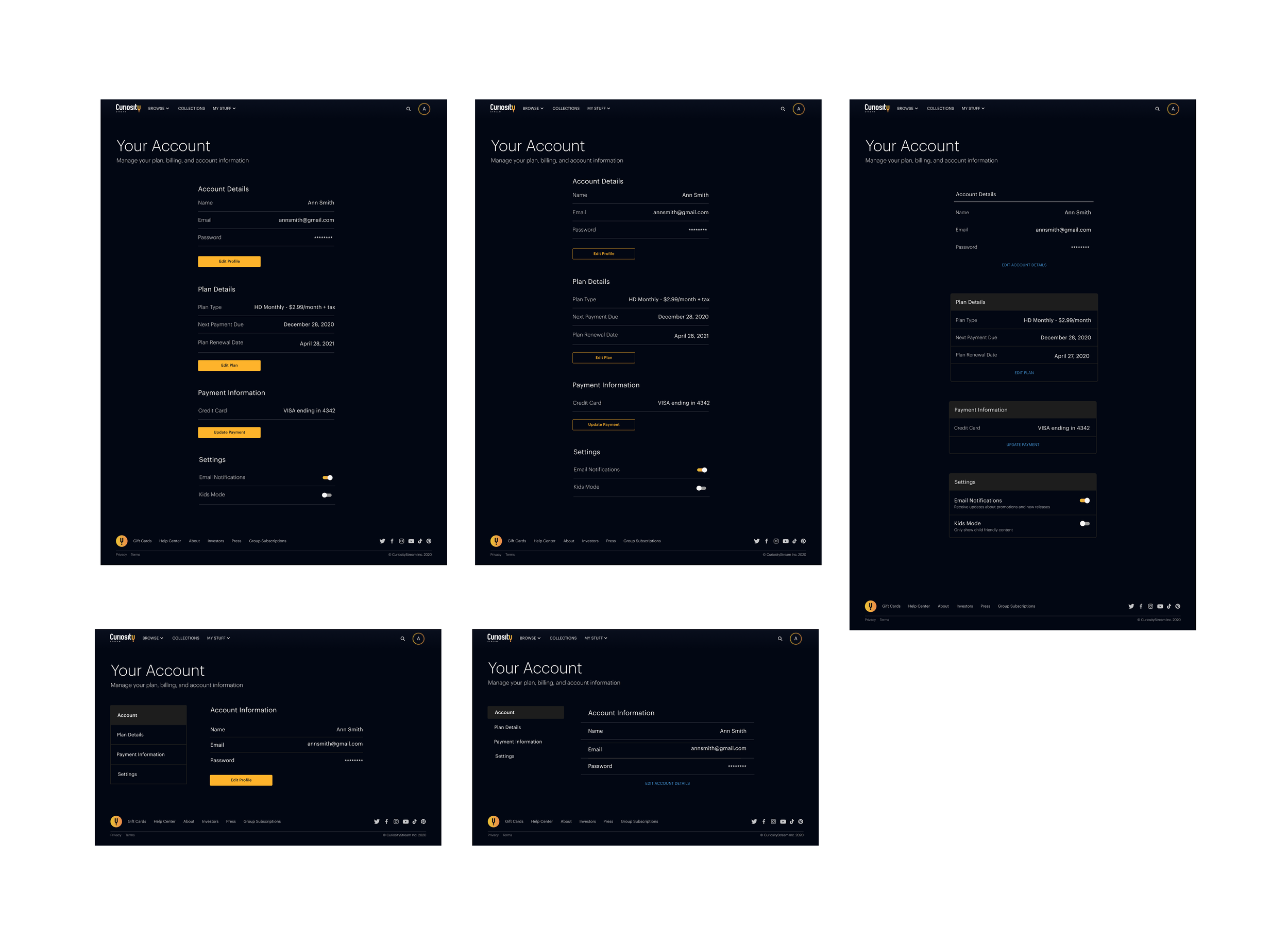
After I finished the main account page, I designed all the user flows within the account page. I created mockups and flows to update passwords and payments, cancel or pause plans, upgrade plans, view billing history, and purchase or redeem gift cards.
Prototyping
Once I finished the high-fidelity mockups, I prototyped the account page in Figma. I included all states and interactions, such as hover and modals. This was especially important for flows such as the cancellation survey, as I was able to show the interactions in greater detail.
Final Product
With an improved layout and information hierarchy, users can more easily navigate the account page. The enhanced UI also matches the rebrand and fits the vision for web and mobile apps. In addition, the new layout solved internal design problems the UX team faced, and we can now quickly add new settings, such as partner streaming services for Premium members.
The Outcome
Analysis
This project was quite complex, as there were multiple user journeys to consider. In addition, Curiosity Stream has different membership options, including Premium members and free accounts for those who sign up through their internet providers.
This project's complexity gave me a greater understanding of building user journeys and user flows. It also reinforced the importance of talking to key stakeholders, such as the head of the customer service team, to address any pain points early in the research process.
Next Steps
The account page will continue to be updated as we add additional streaming services to the Premium plans. The design for the account page will also serve as the basis for the iOS, Android, and TV apps, which will launch in 2022.